10 Proven Ecommerce Website Design Strategies That Skyrocket Sales in 2026
Why Ecommerce Website Design Is Your Brand's Most Powerful Sales Tool
Every single day, millions of online shoppers make snap judgments about brands within seconds of landing on their websites. They don't read every word. They don't explore every page. They feel — and then they decide. That gut reaction, that immediate emotional and cognitive assessment, is shaped almost entirely by your ecommerce website design.
In 2026, the stakes have never been higher. Consumer expectations for online shopping experiences have been elevated by the world's most sophisticated ecommerce brands. Shoppers expect fast-loading pages, intuitive navigation, stunning visuals, and a checkout process so smooth it almost feels effortless. Fall short of these expectations in any meaningful way, and the exit button is one click away.
The good news? You don't need Amazon's budget or Apple's design team to deliver an ecommerce experience that converts. What you need is a clear understanding of the design strategies that actually drive results — and the discipline to implement them consistently.
In this post, we're diving into 10 proven ecommerce website design strategies that the most successful online brands are using in 2026. Whether you're building a new store or optimizing an existing one, these strategies will give you a clear roadmap for design decisions that drive real business growth.
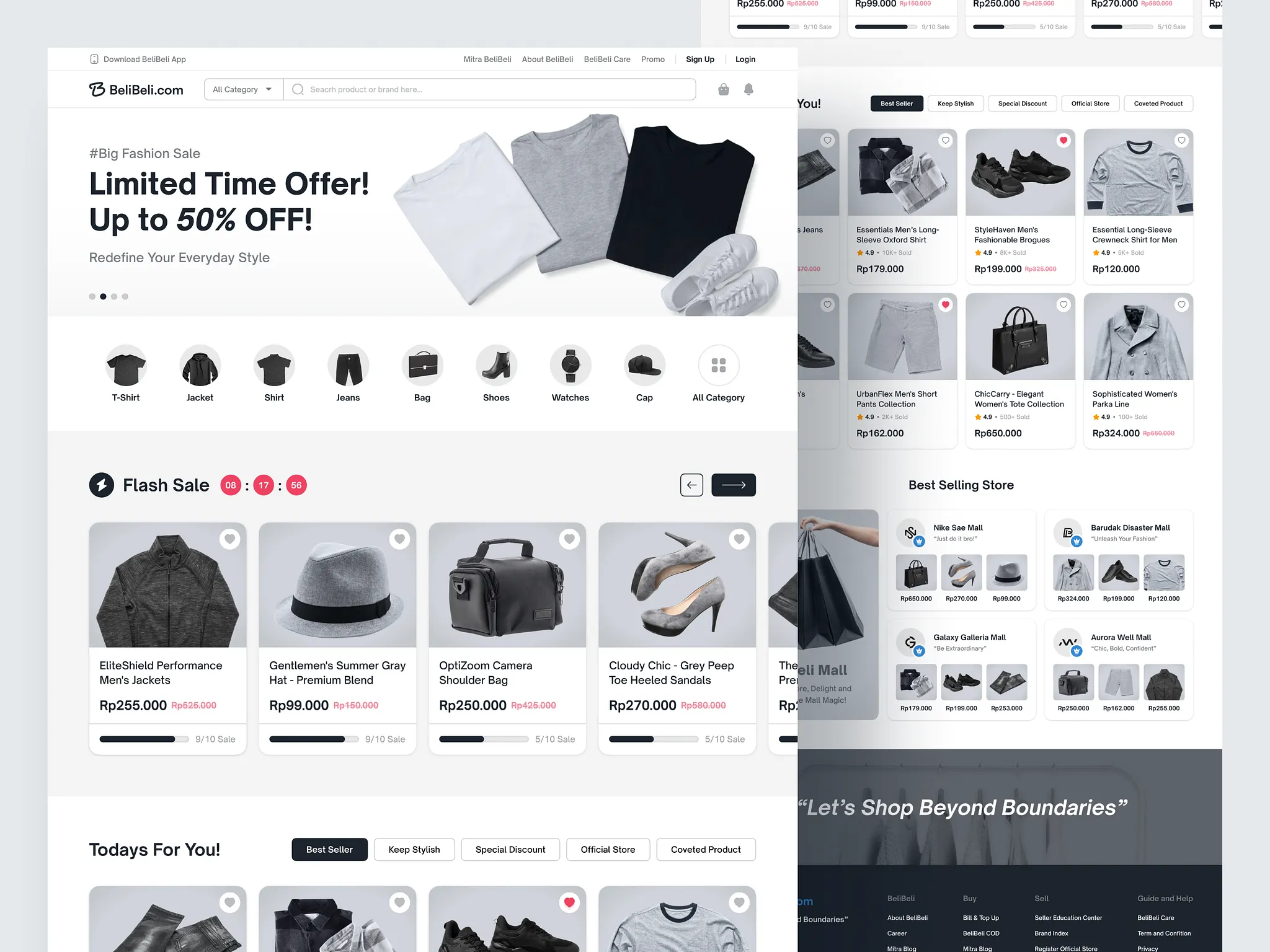
Strategy 1: Lead With a Value Proposition, Not Just a Visual
Your homepage hero section is the most valuable real estate on your entire website. Yet most ecommerce brands waste it on a full-screen image with a vague headline like "Discover Our Collection." This is a missed opportunity of enormous proportions.
The most effective ecommerce website design leads with a crystal-clear value proposition — a statement that answers three questions in five seconds or less: What do you sell? Who is it for? Why should I choose you over everyone else?
Your value proposition should be the focal point of your hero section, supported by a compelling visual and a strong, specific call-to-action. "Free Shipping on All Orders Over $50" is a value proposition. "Handcrafted Leather Goods Built to Last a Lifetime" is a value proposition. "The World's Most Comfortable Running Shoes, Worn by 2 Million Athletes" is a value proposition.
Get this right and every visitor who lands on your homepage immediately understands why they should stay.
Strategy 2: Design for Mobile-First, Then Scale Up
As of 2026, mobile commerce accounts for nearly 65% of all global ecommerce transactions. If your store was designed on a desktop and then "made responsive" as an afterthought, you are delivering a subpar experience to the majority of your customers.
Mobile-first ecommerce website design means starting with the smallest screen and designing upward. Every element — navigation, product images, CTAs, checkout forms — must be optimized for thumb-reach, small screens, and touch interaction before desktop considerations enter the picture.
Specifically, this means:
- Bottom-of-screen navigation for key actions (cart, search, account)
- Large, finger-friendly tap targets (minimum 44x44px)
- Single-column product grids that are easy to scroll
- Auto-fill enabled checkout forms that minimize typing
- Sticky "Add to Cart" buttons on product pages
A mobile-first design isn't just about screen size — it's about designing for how people actually shop on their phones, which is typically in short bursts with limited attention and minimal patience for friction.
Strategy 3: Use Psychology-Driven Product Page Architecture
Your product pages are where purchase decisions are made. Getting the layout, information hierarchy, and psychological triggers right on your product pages can have a dramatic impact on your conversion rate.
High-converting product pages in 2026 follow a proven psychological architecture:
Above the Fold: Primary product image gallery, product title, price, key differentiators (as brief bullet points), size/variant selector, and a prominent "Add to Cart" button. Everything the customer needs to make the core purchase decision should be visible without scrolling.
Mid-Page: Detailed product description (benefit-led, not spec-led), materials and ingredients, size guide, and shipping/returns information in expandable accordion sections.
Below the Fold: Customer reviews (social proof), Q&A section, user-generated photos, and "Customers Also Bought" recommendations.
This architecture respects the different decision stages a shopper moves through — initial assessment, deeper evaluation, and risk reduction — and provides the right information at the right moment in the right format.
Strategy 4: Make Site Speed a Design Priority, Not an Afterthought
Every 100-millisecond delay in page load time reduces conversion rates by approximately 1%. At scale, this seemingly small number becomes a very large revenue leak.
In 2026, Google's Core Web Vitals are a confirmed ranking factor, which means slow pages don't just hurt your conversions — they hurt your organic search visibility too. Site speed is a design and development priority that must be built in from day one, not bolted on after the fact.
Key speed optimization practices in ecommerce website design include:
- Next-generation image formats (WebP, AVIF) with proper compression
- Lazy loading for below-the-fold images
- Minimized and deferred JavaScript and CSS
- Efficient use of third-party apps and scripts (every app adds load time)
- CDN delivery for all static assets
- Server-side rendering or static generation for key pages
Run your store through Google PageSpeed Insights regularly and treat low scores as a conversion optimization problem, not just a technical one.
Strategy 5: Build Trust at Every Touchpoint
Online shoppers are asked to hand over their payment details to a brand they may be encountering for the first time. Trust is not automatically given — it must be earned through deliberate design choices throughout the entire customer journey.
Trust signals that should be woven into your ecommerce website design include:
Security Indicators: SSL certificate (HTTPS), recognized payment logos (Visa, Mastercard, PayPal, Apple Pay), and security badges from providers like Norton or McAfee on checkout pages.
Social Proof: Star ratings and review counts prominently displayed on category pages and product pages, with full review content easily accessible. User-generated photos from real customers are particularly powerful.
Transparency Signals: Clear, easy-to-find returns policy, shipping timeframes, and contact information. A brand that is easy to reach and honest about its policies feels inherently more trustworthy.
Brand Authority: "As seen in" press logos, industry certifications, awards, and sustainability credentials all contribute to brand credibility.
The more trust signals you display — and the more authentically you display them — the lower the psychological barrier to purchase becomes.
Strategy 6: Optimize Your Search and Navigation Architecture
The fastest path to a lost sale is a shopper who can't find what they're looking for. Ecommerce website design must prioritize discoverability at every level — from top-level navigation to on-site search to filter and sorting functionality.
Best practices for 2026 ecommerce navigation:
- Mega menus for stores with deep product catalogs and multiple categories
- Predictive search with thumbnail images, category suggestions, and trending searches
- Smart filters that adjust dynamically based on the category being browsed
- Breadcrumbs on every product and category page
- A persistent, visible search bar on all pages (not hidden behind an icon on mobile)
For large catalogs, faceted navigation — allowing shoppers to filter by multiple attributes simultaneously — is essential. But it must be implemented carefully to avoid the SEO pitfalls of duplicate content and crawl budget waste.
Strategy 7: Reduce Cart Abandonment With Friction-Free Checkout Design
With average cart abandonment rates hovering around 70%, the checkout experience is one of the highest-leverage areas for ecommerce website design improvement. Even small friction reductions can produce significant conversion rate lifts.
Conversion-optimized checkout design principles:
- Guest checkout as the default option — forced account creation before purchase is a major abandonment trigger
- Progress indicators — show shoppers exactly where they are in the checkout process
- Inline field validation — flag errors in real time as shoppers type, not after they hit submit
- Minimal form fields — ask only for what you absolutely need
- Multiple payment options — include digital wallets (Apple Pay, Google Pay, Shop Pay) alongside cards
- Order summary always visible — shoppers should never lose sight of what they're buying
- Clear total cost early — surprise shipping costs revealed at the final step are the number one checkout abandonment trigger
Consider a single-page checkout architecture for mobile, which reduces the cognitive load and the number of taps required to complete a purchase.
Strategy 8: Personalize the Shopping Experience
The era of the one-size-fits-all online store is rapidly ending. In 2026, leading ecommerce brands are using behavioral data and AI to deliver personalized shopping experiences that feel individually tailored — and converting at dramatically higher rates as a result.
Personalization in ecommerce website design can range from relatively simple implementations to sophisticated AI-driven systems:
Basic Personalization: Recently viewed products, "Based on your browsing history" recommendations, personalized email popups based on products viewed.
Intermediate Personalization: Dynamic homepage hero sections that show different content to returning customers vs. new visitors, category page sorting based on past purchase history.
Advanced Personalization: AI-driven product recommendations that adapt in real time based on the current session's browsing behavior, personalized search results, and dynamic pricing or promotions based on customer lifetime value segments.
Even basic personalization implementations consistently outperform generic experiences — making this one of the highest-ROI areas of ecommerce design investment.
Strategy 9: Use Visual Hierarchy to Guide Every Click
Great ecommerce website design is, at its core, a sophisticated exercise in attention management. Your design should guide the visitor's eye — and ultimately their cursor or thumb — toward the actions that matter most to your business.
Visual hierarchy is created through:
- Size: Larger elements naturally attract more attention. Your primary CTA should be the most visually prominent interactive element on the page.