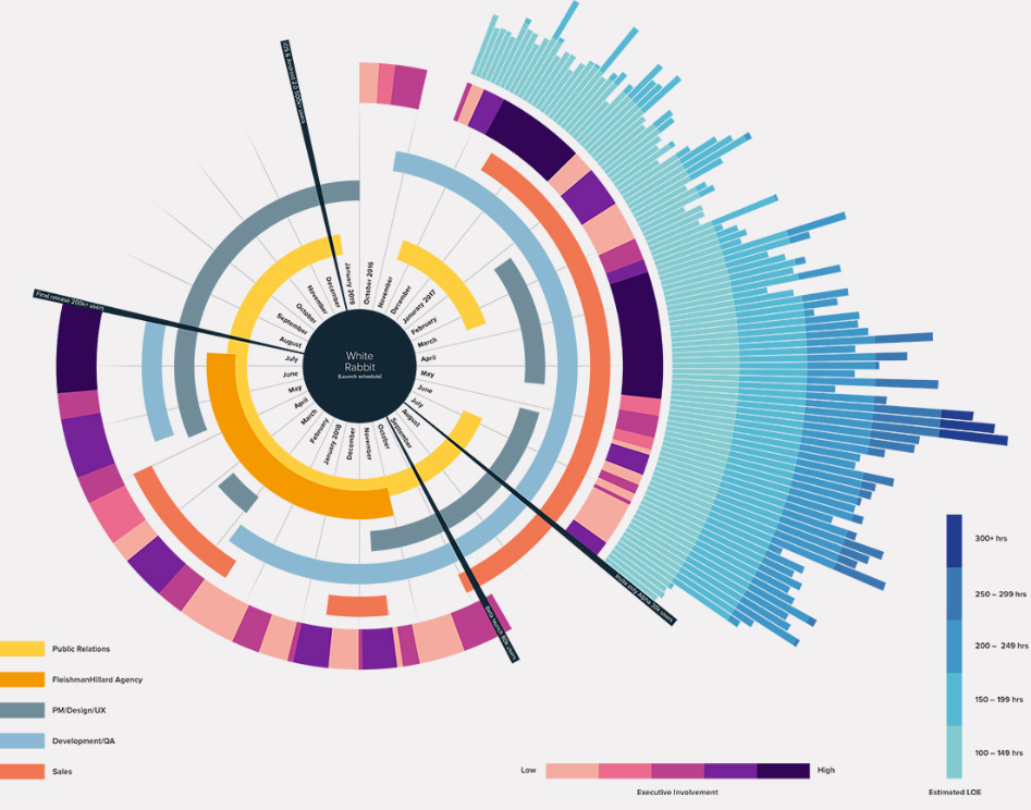
How Business Data Visualization Helps Companies Make Smarter Decisions
Modern workplaces generate information from many different activities, including sales, customer interactions, finance, inventory, websites, and daily operations. As the amount of information increases, it becomes more difficult to interpret large collections of numbers and records.
Data visualization is a method of presenting information through charts, graphs, tables, and visual summaries. Instead of reading lengthy spreadsheets, people can understand patterns and trends by viewing information in a visual format.
Visual reports can make it easier to identify changes over time, compare values, recognize recurring patterns, and notice unusual results. These representations allow information to be reviewed more efficiently than raw numerical data.
Many workplaces collect information from multiple sources. Bringing these records together into a single visual report provides a broader view of day-to-day activities and makes information easier to understand.
Interactive charts allow users to view information from different perspectives. Filters, timelines, and comparison tools can display selected information without changing the original data.
Live reporting is another useful feature. Rather than relying only on periodic reports, updated information can be viewed whenever new records become available. This provides a more current picture of ongoing activities.
Visual reporting is used in many fields, including education, healthcare, finance, manufacturing, retail, transportation, and technology. Common examples include sales summaries, inventory levels, website activity, customer information, and financial records.
Different types of charts are used depending on the information being presented. Bar charts compare values, line charts display changes over time, pie charts show proportions, scatter plots illustrate relationships, and heat maps highlight areas of higher or lower activity.
A well-organized visual report makes information easier to read and reduces the effort required to locate important details. When the same information is presented consistently, communication among teams can also become more straightforward.
As the volume of digital information continues to grow, visual presentation remains an important way to explore, summarize, and interpret complex datasets. Clear charts and reports help transform numerical information into formats that are easier to read and understand.


